Kraft Packaging Brand Standards for Canada Foodservice
Quick Answer: Build a Consistent Kraft Packaging System

Kraft packaging becomes a valuable brand asset when every format—cups, bowls, lunch boxes, trays and delivery containers—uses the same visual rules. For Canadian food brands, the most reliable system combines a defined kraft substrate, approved ink colours, logo-placement standards, readable compliance copy, finish requirements and documented production tolerances.
The key is to approve colour on the actual paper, not only on a screen or white proof. Natural kraft board changes the appearance of ink because its brown base, fibre pattern and coating absorb or influence colour. A dark green may appear warmer, a pale yellow may lose brightness, and fine white type may require an underprint or a larger font size for readability. Brand teams should retain signed printed samples, colour targets, artwork files, dielines and acceptance criteria for every reorder.
For Canada, a packaging system should work across quick-service restaurants in Toronto, café chains in Vancouver, meal-prep operators in Calgary, university foodservice in Montréal and delivery-focused brands serving Ottawa, Halifax and Winnipeg. The package needs to look clear on a retail shelf, in a customer’s hand and in a delivery photograph. It must also remain functional under heat, moisture, grease and transport handling.
| Brand-system element | What to define | Why it matters |
|---|---|---|
| Kraft substrate | Paper shade, weight, coating and fibre appearance | Creates a repeatable natural base for all printed formats |
| Logo hierarchy | Primary logo, secondary mark, minimum size and safe area | Protects recognition on small cups and large meal boxes |
| Colour standard | Pantone target, approved printed sample and variance limits | Reduces unexpected shifts on brown kraft paper |
| Typography | Approved fonts, minimum type size and contrast rules | Improves legibility for ingredients, recycling and handling copy |
| Finish specification | Matte, gloss, varnish, embossing or spot treatment | Supports the intended premium, natural or playful impression |
| Reorder record | Artwork revision, proof sign-off, photos and inspection criteria | Gives procurement teams a dependable reference for repeat orders |
This table is the foundation of a practical approval record. It translates a visual identity into production instructions that designers, purchasing teams and packaging factories can apply consistently.
How Kraft Packaging Shapes Customer Perception

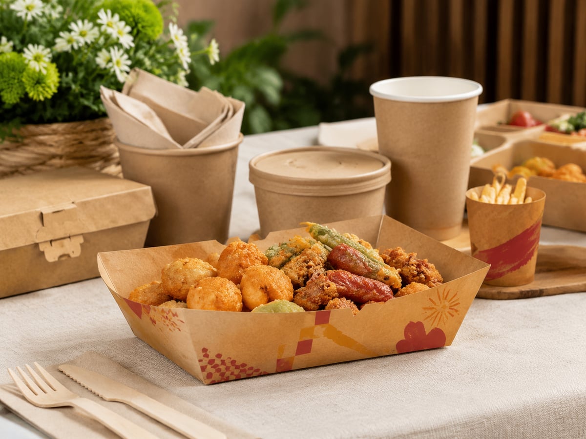
Customers often form an opinion about food before tasting it. A sturdy kraft bowl with a controlled logo, clean ink coverage and well-fitted lid can communicate care, freshness and operational competence. Conversely, muddy colours, distorted branding or a weak box can make a premium menu feel generic, even when the food quality is high.
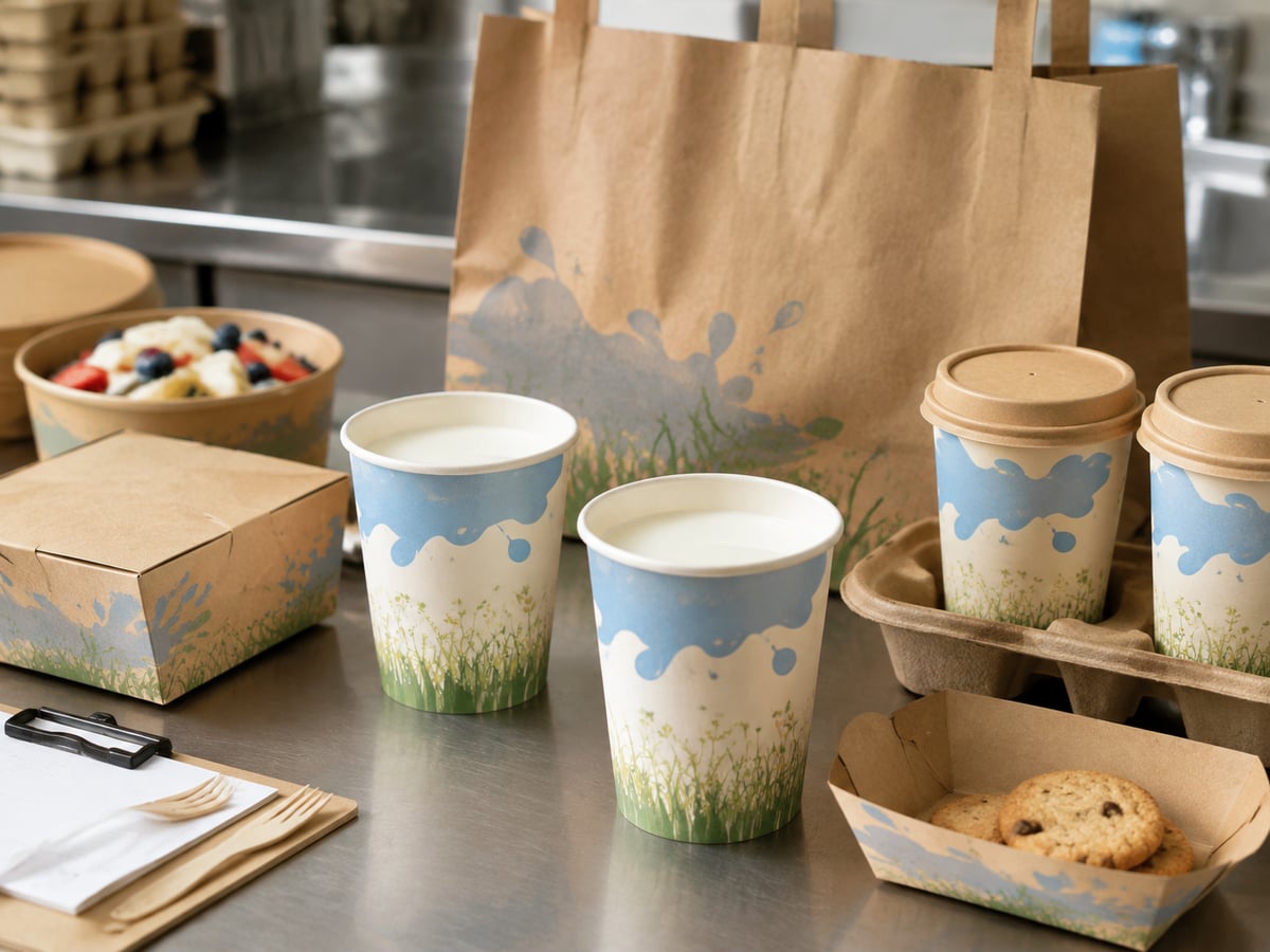
Kraft packaging naturally signals paper-based simplicity, craft food, environmental awareness and warmth. However, “natural” does not automatically mean premium. Premium perception comes from disciplined spacing, high contrast, an appropriate finish, clean die-cut edges and a coherent system across all sizes. A minimalist coffee brand may use dark brown ink, a centred mark and uncoated texture. A modern salad chain may pair kraft stock with a bold black logo and one saturated accent colour. A family meal brand may use large illustrations and colour-coded compartments without losing recognition.
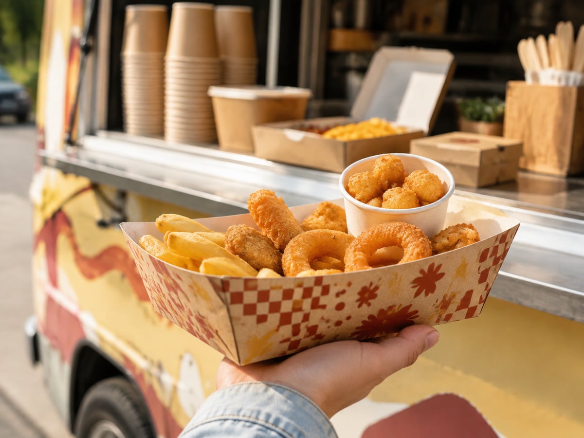
In Canadian urban markets, packaging is frequently photographed before it is opened. Delivery orders moving through downtown Toronto condo lobbies, Vancouver offices or Montréal neighbourhoods are part of the brand experience. The front panel, lid area and hand-held view deserve the same attention as the flat artwork file.
The line chart illustrates a planning scenario for growing demand for branded paper food packaging. Growth is supported by foodservice delivery, café expansion, takeout convenience and the preference for packaging that communicates a more considered material choice.
Natural, Premium, Playful or Functional: Choose One Lead Signal for Kraft Packaging

Every packaging system needs a lead signal. Trying to appear natural, luxury, playful, highly technical and heavily promotional on the same small package usually creates visual noise. Select one primary message and let supporting elements reinforce it.
| Lead signal | Recommended visual approach | Best-fit Canadian applications |
|---|---|---|
| Natural | Visible kraft texture, dark ink, restrained graphics | Organic cafés, bakeries, vegetarian concepts and farm-to-table menus |
| Premium | Generous whitespace, crisp logo, controlled varnish or embossing | Corporate catering, specialty coffee and elevated takeaway dining |
| Playful | Bold icons, friendly illustrations and simple colour blocks | Ice cream, bubble tea, family meals and student-oriented concepts |
| Functional | Clear labels, colour coding, directional copy and large product names | Meal prep, ghost kitchens, hospital foodservice and delivery brands |
| Local craft | Neighbourhood references, limited colours and hand-drawn elements | Independent restaurants in Halifax, Victoria and Québec City |
| Modern sustainable | Minimal graphics, disposal guidance and material transparency | Retail-ready food brands and sustainability-focused chains |
The table shows that the substrate alone does not determine the message. The same kraft lunch box can feel artisanal, premium or playful depending on scale, contrast, layout and finish. A single lead signal helps customers understand the brand quickly.
Balance Regulatory Copy With Visual Impact on Kraft Packaging
Food packaging often needs more than attractive graphics. Brands may require ingredient information, allergen statements, heating directions, bilingual communication, recycling instructions, QR codes, date labels, lot identification or promotional terms. In Canada, English and French requirements can be especially important for products distributed in Québec or nationwide retail programs. The visual system should reserve practical information zones from the beginning instead of adding them after the design is complete.
Use a hierarchy: logo first, product category second, essential customer instruction third, and supporting regulatory copy last. Avoid placing critical small text over highly textured illustrations or dark backgrounds. Maintain adequate contrast, use realistic minimum type sizes and test readability under café lighting and delivery conditions. A QR code should have sufficient clear space and should be tested after printing on the selected kraft surface.
| Panel area | Recommended content | Design control |
|---|---|---|
| Primary front panel | Logo, product name and lead brand signal | Keep uncluttered; use the strongest contrast |
| Side panel | Tagline, web address or social-media prompt | Use secondary type and consistent alignment |
| Base panel | Lot code, date field or production mark | Reserve a printable, accessible area |
| Lid or top flap | Opening cue, tamper message or delivery instruction | Ensure copy remains visible after assembly |
| Back panel | Ingredients, allergen or disposal guidance | Use legible type and avoid overcrowding |
| Label zone | Store label, order ticket or nutrition sticker | Keep clear of key logo and mandatory information |
This content map prevents compliance requirements from weakening shelf impact. It also makes the system easier to adapt from a small snack box to a large multi-compartment meal container.
Design for Shelf, Hand and Delivery Photos
A flat artwork proof cannot fully predict how a package performs in real use. Packaging should be reviewed from three perspectives: shelf visibility, hand-held visibility and delivery-photo visibility. A retail shelf requires clear brand blocks from a distance. A hand-held cup or bowl needs a logo that faces naturally toward the customer or camera. Delivery images require a clean top view, a recognisable side panel and a lid that does not hide the identity.
For a café cup, place the principal mark within the visible hand zone rather than too close to the base. For a burger box, consider the logo position when the lid is closed and when it is partially opened. For salad bowls, ensure the label zone does not cover the brand mark. For multi-compartment meal packaging, use colour bands or icons that help customers distinguish menu categories without changing the master design.
Brand teams can request white samples before final artwork confirmation, then printed pre-production samples for photography and functional review. This step is especially valuable when product launches are planned across several provinces or when packaging will appear in paid delivery-platform advertising.
The bar chart provides a comparative planning view of industries that commonly use branded kraft foodservice packaging. Quick-service restaurants and coffee shops typically need the broadest mix of cups, sleeves, bowls, boxes and delivery formats.
Protect the Brand From Muddy Colours and Weak Contrast
Kraft paper is not a neutral white canvas. Its natural brown tone influences transparent or lightly pigmented inks. Large solid areas can also show variation if ink coverage, paper shade or coating changes. To protect the brand, specify the paper base, print method, ink target and approval process together.
Where accurate bright colour is essential, consider a white underprint, a white label panel, darker spot colours or a design that uses kraft as an intentional background. Black, deep navy, dark green, burgundy and rich brown often provide stronger contrast on kraft stock than light yellow, pastel pink or pale blue. Fine reversed-out text should be enlarged and carefully tested because fibres and ink spread can soften edges.
A realistic quality standard should define acceptable colour variation, registration tolerance, ink coverage, barcode or QR-code readability, scuff resistance and placement accuracy. It should also state how a production batch is sampled and what happens if an issue is identified before shipment.
| Common issue | Likely cause | Practical control |
|---|---|---|
| Muddy accent colour | Light ink printed directly on brown stock | Choose darker ink, add white underprint or revise the palette |
| Weak white text | Small reversed type and uneven fibre surface | Increase font size, weight and clear area around the text |
| Uneven solid ink area | Substrate variation or insufficient ink control | Approve press sample and define coverage acceptance criteria |
| Logo appears off-centre | Artwork positioning or forming tolerance | Set print registration and die-cut alignment tolerances |
| Scuffed graphics | Handling friction during packing and shipping | Specify varnish, packing method and rub-resistance checks | Unreadable code | Low contrast or distorted print surface | Test scanning on final formed packaging before approval |
This table turns common print complaints into preventive checks. It is more cost-effective to solve contrast problems during sampling than after containers have reached a Canadian warehouse or restaurant network.
Keep Kraft Packaging Reorders Visually Consistent
Consistency is earned through documentation. A successful first run is not enough if the next order uses a different board shade, artwork revision or print reference. Each approved format should have a controlled specification file containing the dieline, dimensions, material description, colour references, logo placement, finish, packing configuration and quality criteria.
For brands ordering through the Port of Vancouver, Port of Montréal or Toronto-area distribution centres, reorder planning should account for production lead time, ocean transit, customs clearance, warehouse receiving and seasonal demand. A seasonal promotion may require a separate artwork revision, but the master visual system should remain protected.
Maintain a physical “golden sample” and signed production proof. Digital photos are useful, but they cannot fully represent paper texture, ink density, gloss level or structural strength. Match the next production run against the signed sample, then retain a batch sample for traceability.
The area chart shows a directional shift toward documented brand systems. As foodservice companies operate more locations and more ordering channels, repeatable visual standards become more valuable than one-off packaging artwork.
Brand QA Checklist for Printed Bulk Orders
Bulk packaging quality assurance should begin before production and continue through shipment. A clear checklist aligns the brand owner, procurement team and manufacturer. It should cover visual accuracy, structural function, food-contact documentation, packing and batch identification.
| QA checkpoint | What to verify | Approval evidence |
|---|---|---|
| Artwork revision | Correct logo, bilingual copy, dieline and legal text | Signed PDF proof with revision number |
| Material confirmation | Board grade, coating and food-contact suitability | Material specification and applicable documentation |
| Printed sample | Colour, contrast, registration and finish on actual kraft | Approved physical pre-production sample |
| Structure test | Lid fit, folding, stacking, leak resistance and grease resistance | Functional test record and customer sign-off |
| Production inspection | Dimensions, print placement and visible defect rate | Inspection report with batch reference |
| Shipment release | Carton marks, quantity, packing and loading condition | Final release record and shipment photographs |
This checklist is suitable for restaurant chains, distributors and private-label buyers. Independent inspection companies may also be appointed before shipment where a buyer requires third-party verification.
Fude Packaging: Manufacturing Scale, Technology and International Support
Fude Packaging supports foodservice buyers that need a controlled source for branded paper cups, bowls, boxes, trays and multi-compartment meal packaging. The company’s manufacturing capability includes more than 20 years of packaging experience, a self-owned 30,000 m² production base in Shandong and automated output capacity of up to 120,000 units per day. This scale helps customers consolidate related paper food-packaging categories under one production partner.
From a technology perspective, Fude Packaging provides artwork and dieline checking, Pantone-oriented colour matching, prototype development, white samples, digital proofs and printed pre-production proofs. An in-house laboratory supports practical testing for strength, heat resistance, grease resistance, leak prevention, lid compatibility and print performance. These controls are useful for Canadian buyers evaluating packaging for hot beverages, sauced meals, cold salads and takeaway combinations.
Its manufacturing controls cover incoming-material inspection, production monitoring, final inspection and batch verification. Customers can request documentation relevant to food-contact and quality-management needs, including FSC, ISO 9001, FDA-related and other destination-market documentation where applicable. Full-batch traceability helps purchasing teams connect approved samples and production records to incoming shipments.
Service capability is equally important for overseas projects. Fude Packaging works with more than 500 business clients and supports OEM and ODM development, scheduled orders, export-ready packing and common freight options. For buyers serving Canada, the team can help plan product selection, sample stages, order timing and documentation for delivery through major trade routes and Canadian distribution networks. Explore available food packaging formats, review custom packaging services, learn more about Fude Packaging, or contact the packaging team for a project discussion.
The comparison chart is an operational illustration rather than a price quotation. It highlights why buyers often assess suppliers on proofing, inspection, traceability and export coordination—not only unit cost.
FAQ: Creating a Brand System for Kraft Packaging
How can kraft packaging strengthen brand recognition?
Use the same logo scale, colours, type hierarchy, illustration style and layout rules across cups, bowls, boxes and trays. Repetition helps customers identify the brand quickly across dine-in, takeaway, retail and delivery moments.
Why does colour change on kraft paper?
The brown paper base affects how ink appears. Paper shade, fibre texture, coating, ink opacity and print coverage can all influence the final result. Always approve colour on a printed sample made with the intended material.
How can several sizes remain visually consistent?
Create a master grid with logo safe areas, colour zones, typography rules and panel assignments. Adapt the layout to each dieline instead of simply shrinking the same artwork. Small formats need simplified information and larger formats can carry more supporting content.
Which finishes add real value?
Matte varnish can support a natural or modern look, while selective gloss, embossing or a controlled metallic detail may add premium impact. The finish should support the brand strategy and remain suitable for the intended foodservice use.
What files and standards should be archived?
Archive editable artwork, final print PDFs, dielines, material specifications, Pantone references, signed samples, photos, inspection records, carton marks and approved production tolerances. Use version control so every reorder follows the correct standard.
What future trends should Canadian brand teams plan for?
By 2026 and beyond, more buyers will expect packaging systems to combine sustainable-material choices, clearer disposal communication, data-enabled QR codes, smaller minimum design variations and stronger batch traceability. Policy changes, municipal waste programs and retailer requirements may also influence material selection and labelling. Build flexibility into the design system so it can respond without weakening the core brand.

About the Author
Fude Packaging is a professional flexible packaging manufacturer serving global food brands, wholesalers, and distributors. Our team shares practical insights on custom packaging, printing technology, food-safe materials, and industry trends to help businesses build better packaging solutions.
Share
Product Category
Start Your Project With Fude Today
Related Post
-

Canada Wholesale Paper Bowl Buying Guide and Supplier Tips
For buyers in Canada, wholesale paper bowl programs are no longer only about purchasing packaging at a lower unit price. They are now tied to sustainability expectations, delivery performance, menu fit, branding, food safety compliance, and predictable inventory planning. Restaurants in Toronto, quick-service chains in Vancouver, caterers in Calgary, meal-prep brands in Montreal, and distributors serving Atlantic Canada all need bowl supply solutions that can support growth without creating stock risk or quality inconsistency.When companies evaluate paper bowl wholesalers, they usually compare more than price. They look at bowl sizes, leak resistance, lid compatibility, print quality, coating choices, compostable options, order flexibility, lead times, and whether the supplier can support long-term procurement planning. In a market shaped by takeout, third-party delivery, and growing consumer interest in responsible packaging, the right wholesale paper bowl supplier can improve both operations and brand perception.This guide explains how bulk paper bowl orders work for the Canadian market, where the major cost advantages come from, how quality is maintained across large production runs, what inventory and logistics support buyers should expect, and how strong supplier relationships reduce total landed cost over time. It also covers product types, buying advice, applications, industries, practical case examples, and future 2026 trends in policy, technology, and sustainability.Bulk paper bowl ordering in Canada is most beneficial when a buyer needs stable supply, better unit pricing, consistent food-safe quality, and the ability to match packaging to specific menu applications such as soups, noodles, grain bowls, salads, desserts, and takeaway meals. The strongest wholesale programs combine volume pricing, reliable manufacturing control, customization, shipping efficiency, and after-order support rather than competing on price alone.For Canadian importers, distributors, food chains, and growing restaurant groups, the best paper bowl wholesaler is one that can deliver repeatable quality across large orders, offer practical minimum order quantities, provide branding options, and coordinate shipping into hubs such as Vancouver, Prince Rupert, Montreal, Halifax, and Toronto-area warehouses. Buyers should also check food-contact compliance, coating material, lid fit, stacking stability, temperature performance, and the supplier’s ability to handle seasonal demand peaks.In practical terms, paper bowl wholesale programs work best when the supplier understands the end use. A ramen concept in Richmond, British Columbia may prioritize heat retention and anti-leak seams. A salad chain in Mississauga may care more about grease resistance, PET lid clarity, and display presentation. A distributor in Edmonton may need mixed SKUs, pallet optimization, and schedule-based replenishment. The right program is therefore built around usage, not just carton count.Many Canadian buyers also ask about environmental claims. Where compostability or sustainable sourcing matters, businesses should verify whether the bowls use approved materials and whether claims align with local waste-management realities. Packaging that performs well in food service still needs to satisfy customer expectations on disposal, brand image, and municipal rules.The biggest reason buyers shift from spot purchasing to bulk paper bowl orders is cost control. On paper, lower unit pricing is the obvious benefit. In reality, the full savings come from several layers: reduced per-piece manufacturing cost, better shipping efficiency, lower emergency replenishment risk, standardized SKUs, and fewer operational disruptions.When production is scheduled in larger runs, suppliers can optimize raw material usage, machine setup, print alignment, and carton packing. That improves efficiency and allows part of the savings to be passed to the buyer. For Canadian businesses importing containers from overseas, larger orders can also reduce freight cost per thousand bowls, especially when container utilization is planned well.Another major saving comes from avoiding fragmented procurement. If a chain in Ottawa places several small urgent orders throughout the year, it often pays more in freight, warehouse handling, and administrative cost than if it placed a quarterly or seasonal order with forecasted replenishment. A structured wholesale program reduces this friction.There is also a branding economy of scale. Custom printing plates, color setup, and sampling become more cost-effective when spread across larger order volumes. For companies building consistent storefront and delivery branding across multiple provinces, this is often a stronger value driver than the basic unit price discount.Order VolumeTypical Buyer TypeCost EffectFreight EfficiencyPrint EconomicsBest Use Case10,000 to 30,000 bowlsSingle-location restaurantLimited unit savingsLower container efficiencyBasic or shared print runsTesting new menu packaging30,000 to 80,000 bowlsSmall chain or local distributorModerate cost reductionBetter carton planningMore viable custom brandingRegional supply programs80,000 to 150,000 bowlsMulti-store food groupStrong unit-price improvementEfficient LCL or partial FCL planningStable brand consistencyQuarterly procurement150,000 to 300,000 bowlsNational distributorVery competitive pricingHigh freight efficiencyLower setup cost per unitCross-provincial distribution300,000 to 600,000 bowlsMajor chain or importerExcellent landed-cost controlFull container optimizationPremium custom print valueSeasonal or annual contracts600,000+ bowlsLarge wholesale networkBest long-term savings potentialMaximum shipping utilizationHighly efficient private label programsNationwide standardizationThe table above shows why cost savings increase with order scale, but it also highlights that volume alone does not solve everything. Buyers need the right SKU mix and realistic demand forecasting. Overstocked bowls tie up working capital; under-ordering leads to costly rush shipments. The most successful buyers balance price breaks with inventory movement speed.var ctx1 = document.getElementById('lineChartGrowth').getContext('2d');var chart1 = new Chart(ctx1, {type: 'line',data: {labels: ['2022', '2023', '2024', '2025', '2026'],datasets: [{label: 'Estimated Canada Paper Bowl Wholesale Market Growth (CAD millions)',data: [118, 132, 149, 168, 191],borderColor: 'rgb(75, 192, 192)',backgroundColor: 'rgba(75, 192, 192, 0.15)',fill: false,tension: 0.25}]},options: {responsive: true,maintainAspectRatio: false}});The growth trend shown above reflects the wider shift in Canada toward takeaway, meal delivery, grab-and-go retail, and sustainability-driven packaging changes. Buyers who lock in strong wholesale arrangements early generally gain better continuity and pricing leverage than businesses that continue buying on a reactive basis.Quality consistency is one of the most important issues in paper bowl wholesale. In Canada, packaging buyers need each batch to behave the same way whether the bowls are used for poutine, ramen broth, chili, poke bowls, frozen desserts, oatmeal, or deli salads. If one shipment has weaker rim strength, poor lid fit, color inconsistency, or seam leakage, it can disrupt service and damage customer trust.Large order consistency depends on controlled raw materials, process discipline, production inspection, and packaging standards. Buyers should ask how the supplier manages paperboard sourcing, coating application, forming pressure, print registration, dimension tolerance, and drop or leak testing. It is also useful to request production photos, test reports, and retention samples for repeat orders.For Canadian distributors serving multiple customer segments, consistency matters because one failed lot can affect many downstream accounts. A wholesaler selling into Winnipeg, Saskatoon, and Regina may have to support noodle shops, cafeterias, and supermarket deli counters at the same time. The bowl must perform in all those settings, so factory-level quality control is not optional.Good wholesale suppliers maintain standard operating procedures and quality checkpoints throughout production instead of relying only on final inspection. That means checking paper thickness, rim curl quality, sidewall forming, coating adhesion, printing precision, and carton labeling during manufacturing. Repeatability is especially important for custom-printed orders because brand colors and graphics need to stay stable across shipments.Quality FactorWhy It MattersCommon Test or CheckRisk if IgnoredRelevant Canadian Use CaseBuyer Question to AskLeak resistancePrevents broth or sauce seepageHot liquid hold testCustomer complaints and food lossSoup bars in MontrealHow long can the bowl hold hot liquids?Grease resistanceStops oil migrationOil exposure checkWeak bowl structure and stainsPoutine outlets in Quebec CityWhich coating performs best for fried foods?Rim strengthImproves lid fit and carryingCompression and stacking testLid pop-off during deliveryDelivery kitchens in TorontoWhat is the rim tolerance range?Print consistencyProtects brand appearanceColor and registration inspectionOff-brand presentationNational franchise programsHow do you control print matching?Size accuracyEnsures portion controlDimension measurementMenu cost distortionMeal-prep companies in CalgaryWhat are the size tolerances?Lid compatibilitySupports safe transportFit and shake testSpills in transitFood delivery platforms in VancouverCan you provide matching lid samples?The quality table shows that bowl performance is tied directly to real food-service operations. In other words, a bowl is not “good” in general terms; it is only good if it performs reliably in the exact application for which it is purchased.Buyers in Canada should also pay attention to certification and compliance language. Food-contact safety documentation, sustainable paper sourcing, and compostability claims can all be important depending on province, city, and end customer expectations. For example, a campus dining account in British Columbia may ask about compostable options, while a retail deli account in Ontario may focus more on leak resistance and print quality. Good suppliers provide clear technical information rather than vague environmental claims.Inventory management is often undervalued when buyers compare suppliers. Yet for many Canadian businesses, supply reliability is just as valuable as price. Demand for paper bowls can shift quickly due to weather, tourism, sports events, delivery campaigns, or menu changes. A sudden cold spell in Edmonton can increase soup sales. Festival season in Toronto can raise takeaway demand. Student return periods in Halifax and Waterloo can change bowl consumption patterns.Strong wholesale suppliers help buyers forecast demand, recommend sensible SKU consolidation, and plan replenishment windows. This support reduces dead stock and cuts the risk of emergency air freight or local substitute purchases. In wholesale distribution, the right inventory strategy often decides whether a program stays profitable.Some buyers need scheduled releases rather than one-time large arrivals. Others prefer production reservations tied to monthly call-offs. For importers serving retailers across Canada, staggered shipping and warehouse planning may be more useful than simply ordering the largest possible quantity.Inventory ModelHow It WorksAdvantagesChallengesIdeal BuyerPractical ExampleSingle bulk seasonal orderLarge order shipped for one seasonBest unit-cost opportunityHigher storage needLarge chainSummer salad campaign in OntarioQuarterly replenishmentOrders placed every three monthsBalanced cash flow and stockNeeds good forecastingRegional distributorPrairie foodservice distributorMonthly call-off planProduction reserved, shipments released monthlyBetter stock controlRequires reliable communicationMeal-prep brandMontreal healthy bowl conceptMixed SKU containerSeveral bowl sizes in one shipmentSupports menu varietyMore planning complexityImporter and wholesalerBC distributor serving ramen and dessert shopsSafety stock programExtra buffer stock maintainedReduces stockout riskTies up capitalFast-growing chainNational delivery-first restaurant groupTrial-to-scale programSmall first run followed by larger repeatLimits launch riskLess initial price advantageNew brandStartup in Ottawa testing custom bowlsThe best inventory approach depends on business maturity. A local operator with one or two stores may need flexibility more than maximum volume discounts. A distributor with hundreds of downstream customers may prioritize SKU stability and reorder rhythm. In both cases, a supplier that understands planning can become more valuable than a cheaper supplier that only ships when asked.Buyers looking for broader packaging category support often benefit from working with a supplier that can align bowls with other takeaway formats. For example, businesses sourcing bowls may also need Custom Paper Food Container products for meal boxes and side dishes, or Custom Paper Cup products for beverage service. Combining categories can simplify forecasting and standardize branding.Customization has become a central part of paper bowl procurement in Canada. It is no longer limited to adding a logo. Buyers now request specific bowl capacities, kraft or white finishes, vented or clear lid combinations, bilingual label-ready designs, seasonal graphics, stackability requirements, and menu-based structure choices.For delivery-oriented brands, custom packaging helps reinforce recognition after the food leaves the store. For distributors, private-label paper bowls can create margin differentiation. For restaurant groups, consistent print and color quality support customer trust across provinces and locations.Most custom wholesale paper bowl programs can be designed around several variables: size, paper type, coating, wall structure, graphic design, and accessory compatibility. In Canada, where operators often balance sustainability messaging with high-performance food delivery needs, it is important to choose customization options that support both brand story and operational reality.Customization OptionDescriptionBrand BenefitOperational BenefitBest ForCanadian ExampleCustom logo printingSingle or multi-color brandingHigher visibilityClear product identityRestaurant chainsToronto urban lunch brandKraft or white paper finishNatural or clean premium lookSupports brand positioningMatches menu styleSalad and wellness conceptsVancouver health food storesCustom bowl sizesPortion-specific capacitiesConsistent presentationMenu cost controlMeal-prep operatorsCalgary subscription meal serviceCoating selectionPE or compostable alternativesEnvironmental messagingBetter food compatibilityInstitutions and eco-led brandsCampus dining in BCMatching lid systemsPET, PP, or paper-compatible lidsImproved takeaway lookSafer transitDelivery kitchensMississauga noodle delivery operatorSeasonal campaign graphicsLimited-time promotional designsMarketing impactSKU differentiationRetail and franchise groupsHoliday menu in MontrealCustomization should always be tied to use. A beautifully printed bowl that fails during delivery creates more damage than benefit. Buyers should therefore begin by defining the application first, then the visual goals second. Sample testing with real menu items is especially useful before approving larger private-label runs.For businesses comparing category options, dedicated Custom Paper Bowl products can be reviewed alongside matching lids and related takeaway items to ensure the program works as a complete system rather than as separate components.var ctx2 = document.getElementById('barChartDemand').getContext('2d');var chart2 = new Chart(ctx2, {type: 'bar',data: {labels: ['QSR Chains', 'Asian Restaurants', 'Meal Prep', 'Caterers', 'Deli Retail', 'Campus Foodservice'],datasets: [{label: 'Estimated Annual Demand Share for Paper Bowls in Canada (%)',data: [26, 22, 15, 11, 14, 12],backgroundColor: ['rgb(255, 99, 132)','rgb(54, 162, 235)','rgb(255, 206, 86)','rgb(75, 192, 192)','rgb(153, 102, 255)','rgb(255, 159, 64)']}]},options: {responsive: true,maintainAspectRatio: false}});The demand comparison above shows why customization matters. Different sectors use bowls in different ways. Asian takeout may prioritize deep bowls with lid security; deli retail may focus on presentation; campus and corporate foodservice may emphasize policy compliance and sustainability messaging.Logistics performance has a direct effect on landed cost, service continuity, and customer satisfaction. For Canada, shipping strategy is especially important because inventory may enter through West Coast or East Coast ports and then move long distances inland. Importers may use Vancouver or Prince Rupert for Western Canada, Montreal or Halifax for Eastern Canada, and then route goods toward Toronto, Mississauga, Winnipeg, Calgary, or other distribution centers.Because paper bowls are lightweight but volumetric, freight planning is not only about weight. Carton dimensions, nesting efficiency, pallet build, and container loading patterns all affect shipping economics. Suppliers that understand packaging density can help buyers use container space more effectively.Transit reliability also matters. If a distributor plans promotions around a new bowl launch and the goods arrive late, lost sales can exceed any nominal savings achieved on product price. That is why strong suppliers provide realistic lead times, production scheduling transparency, and document accuracy for customs clearance.Logistics FactorWhy It MattersBuyer ImpactBest PracticeCanadian Reference PointRisk if Poorly ManagedPort selectionInfluences inland cost and speedLower total landed costMatch import route to customer geographyVancouver, Montreal, HalifaxHigher trucking expenseContainer utilizationImproves freight efficiencyLower per-unit shipping costOptimize carton size and SKU mixNational import programsWasted cubic spaceLead-time visibilitySupports planning accuracyReduces stockoutsUse milestone updatesToronto-area distributionUrgent replacement buyingCustoms documentationPrevents clearance delaysFaster releaseCheck HS codes and product detailsCBSA clearance processesPort storage chargesPallet and warehouse formatAffects receiving efficiencyLower handling costAlign with warehouse systemMississauga 3PL operationsSlower put-away and damageDelivery schedulingHelps downstream serviceBetter allocation planningCoordinate with promotions and seasonalityRestaurant chains across AlbertaStock imbalance between sitesThe table above shows why logistics should be evaluated as part of the product itself. A bowl with a good ex-factory price can become expensive if it is shipped inefficiently or arrives unpredictably. Buyers should therefore request landed-cost thinking, not only product quotation.Many importers also prefer suppliers that can support broader packaging coordination under one service structure. Access to Custom and Wholesale food Paper packaging support can simplify artwork preparation, sampling, packing confirmation, and shipment coordination when multiple SKUs are involved.Payment structure has a major influence on purchasing confidence, especially for Canadian buyers managing exchange rates, seasonality, and warehouse investment. The right terms depend on order scale, relationship maturity, customization level, and production complexity.For first orders, many suppliers require deposits before production. For repeat orders with proven volume, more flexible arrangements may become possible, such as balance against shipping documents or short credit windows after dispatch. Large distributors may negotiate framework agreements tied to forecast commitments, while smaller restaurant groups may prioritize lower initial exposure with trial orders.Buyers should assess payment options in terms of total business health, not just immediate cash preservation. A slightly larger deposit on a well-controlled custom order can be safer than a looser arrangement with a poorly managed supplier. Predictability matters more than headline flexibility.Payment ModelHow It WorksBest ForAdvantagesLimitationsTypical Buyer SituationDeposit plus balance before shipmentPartial prepayment, remainder before dispatchNew custom ordersClear production commitmentHigher upfront cash needFirst private-label bowl orderDeposit plus balance against documentsFinal payment after shipping paperworkEstablished importersBetter cash timingNeeds trust and process disciplineRegional Canadian wholesalerRepeat-order short creditPayment after shipment on agreed termsLong-term customersSupports working capitalUsually volume dependentMulti-provincial distributorAnnual contract pricingVolume commitment over set periodLarge chainsBudget stabilityLess flexibility for sudden SKU changesNational foodservice groupTrial order modelSmaller first batch with limited riskNew brandsEasy testingHigher unit priceStartup soup concept in OttawaMixed-category procurement termsTerms across bowls, cups, and containersBroad packaging buyersStreamlined accounts payableRequires larger scopeChain buying integrated packagingCanadian buyers should also account for currency movement when evaluating payment terms. A good supplier relationship often includes proactive quote validity windows and production timing advice that helps the buyer manage exchange exposure. This is particularly important for companies that place large seasonal orders tied to back-to-school, winter soup promotions, or summer cold-food campaigns.The strongest savings in wholesale packaging usually appear over time, not on the first order. When a supplier learns a buyer’s menu, forecast rhythm, quality standards, warehouse format, and branding priorities, the relationship becomes more efficient. Lead times improve, samples become more accurate, and product recommendations become more useful.Long-term partnerships are particularly valuable in Canada because the market is geographically spread out and buyer requirements vary by region. A supplier that supports noodle concepts in Vancouver, premium deli programs in Montreal, and broadline distribution into Manitoba and Saskatchewan will gradually understand how product details influence sell-through and customer satisfaction.Partnership value shows up in several ways: faster new-item development, more practical MOQ planning, better documentation support, and stronger response during seasonal peaks. It also helps when policy or sustainability expectations change, because the supplier already understands the buyer’s market position and can suggest suitable material or design adjustments.Case example one: a regional distributor in British Columbia originally bought generic bowls from multiple sources, leading to inconsistent lid fit and uneven stock levels. After consolidating with one wholesale supplier and aligning three core sizes for soup, noodle, and salad applications, the distributor reduced SKU confusion, improved reorder timing, and lowered emergency freight incidents during winter demand surges.Case example two: an Ontario restaurant group with locations in Toronto, Hamilton, and London moved from plain stock bowls to custom-branded takeaway packaging. Instead of customizing every size at once, the company began with its two highest-volume bowl formats. That phased approach reduced cost risk, simplified launch control, and improved customer recognition across delivery platforms.Case example three: a Quebec food retailer needed bowls that balanced presentation and moisture resistance for deli-ready meals. By testing samples with actual refrigerated items before production approval, the buyer avoided a costly mismatch between lid clarity expectations and condensation performance. This is a good example of how partnership thinking prevents downstream problems.var ctx3 = document.getElementById('areaChartTrend').getContext('2d');var chart3 = new Chart(ctx3, {type: 'line',data: {labels: ['2023', '2024', '2025', '2026'],datasets: [{label: 'Shift Toward Sustainable and Customized Bowl Programs (%)',data: [38, 47, 56, 68],borderColor: 'rgb(75, 192, 192)',backgroundColor: 'rgba(75, 192, 192, 0.25)',fill: true,tension: 0.3}]},options: {responsive: true,maintainAspectRatio: false}});The area trend illustrates what many buyers already see: the market is moving beyond generic packaging toward programs that combine sustainability claims, application fit, and stronger visual branding. Wholesale suppliers that can support this shift are more likely to become long-term partners rather than one-time vendors.Shandong Fude Packaging Co., Ltd. serves global food-service buyers as a factory-based packaging partner focused on practical, brand-ready, and environmentally responsible disposable food packaging. For Canadian buyers seeking stable paper bowl sourcing, the company’s value lies in its combination of technology, manufacturing discipline, and service coordination rather than in single-product pricing alone.On the technology side, Fude uses integrated production systems that support flexographic printing, die-cutting, forming, and quality inspection for food-grade paper packaging. These capabilities are useful for Canadian buyers that require clean print results, repeatable dimensions, and consistent bowl performance across reorder cycles. The company’s technical approach also supports custom structures, coating choices, and design adjustments for specific use cases such as soup, noodles, salad, or dessert packaging.On the manufacturing side, Fude operates a modern large-scale facility with automated production lines, organized workflow, and warehousing controls that support stable output for wholesale programs. This manufacturing base helps buyers who need repeat orders with dependable lead times, from smaller trial runs to large export volumes. In addition to bowls, the company can support related packaging categories, including Custom Paper Food Container products and Custom Paper Cup products, which can be useful for Canadian distributors and restaurant groups aiming to standardize their takeaway packaging portfolio.On the service side, Fude supports customers through requirement review, artwork preparation, sample confirmation, production follow-up, and delivery coordination. That service model is especially important for overseas buyers who need clear communication, practical customization advice, and manageable lead times. Businesses exploring broader category development can review the company background to understand its export experience, while buyers seeking end-to-end support for branding and order setup can use its Custom and Wholesale food Paper packaging services.For Canada, the company’s relevance is strongest for importers, wholesalers, restaurant chains, takeaway platforms, and emerging food brands that need an organized supply partner capable of combining cost efficiency with customization and quality control. Buyers looking for dependable Custom Paper Bowl products across multiple sizes and applications may find that a factory-direct relationship offers better visibility than fragmented spot buying.Capability AreaWhat It IncludesBuyer BenefitWhy It Matters in CanadaBest Fit CustomerPractical OutcomeTechnological capabilitiesPrinting, forming, die-cutting, quality checksStable product consistencySupports branded repeat ordersRestaurant chainsUniform bowl appearance across locationsManufacturing capabilitiesLarge facility and automated linesReliable outputHelps seasonal planningImporters and distributorsBetter supply continuityService capabilitiesSampling, artwork, coordinationSmoother project executionUseful for overseas sourcingPrivate-label buyersFewer launch errorsCustomization supportSize, print, coating, structure optionsBrand and menu alignmentImproves differentiationFood startupsPackaging that matches concept identityMulti-category packagingBowls, cups, containersConsolidated sourcingSimplifies procurementMulti-unit operatorsCoordinated packaging systemsExport experienceGlobal client serviceBetter documentation and process flowImportant for Canadian import handlingWholesale buyersReduced communication frictionThe summary above explains why many buyers prefer suppliers that combine factory strength with service support. In packaging procurement, a supplier’s real value is measured by execution reliability after the order is placed, not just the quote attached to the first email.1. What should a Canadian buyer look for first when ordering wholesale paper bowls?Start with the actual food application: hot soup, noodle broth, salad, rice bowl, dessert, or deli use. Then check leak resistance, coating, lid fit, print needs, and order quantity. After that, compare landed cost, not only unit price.2. Are bulk paper bowl orders always cheaper?Usually yes on a per-unit basis, but the real savings depend on forecasting and inventory turnover. Buying too much can reduce cash efficiency, while buying too little can trigger rush freight or stockouts.3. Which Canadian regions have the highest demand for wholesale paper bowls?Demand is strongest in major urban and distribution hubs such as Toronto, Mississauga, Vancouver, Montreal, Calgary, and Edmonton. However, growth is also strong in secondary markets where takeaway and deli retail are expanding.4. Can wholesale paper bowls be customized for restaurant branding?Yes. Common options include logo printing, custom colors, kraft or white finishes, size selection, and coordinated lids. Buyers should test samples with real menu items before approving production.5. How long does a custom wholesale bowl order usually take?Lead time varies by design complexity, quantity, and shipping plan. Sample approval, production scheduling, and freight route all influence the final timeline. Buyers should always build in extra time for first orders.6. Do I need different bowls for hot and cold foods?Often yes. Hot soups and oily foods may need stronger leak and grease resistance, while cold deli or salad applications may prioritize presentation and lid clarity. One universal bowl is rarely the most efficient solution.7. How can I reduce logistics cost when importing into Canada?Use the port and inland route that best match your warehouse network, optimize container loading, consolidate SKUs carefully, and plan replenishment before peak demand periods. Late planning usually costs more than product price differences.8. What industries buy wholesale paper bowls most often?Quick-service restaurants, Asian takeout, meal-prep brands, campus dining, caterers, supermarket delis, food trucks, and distribution wholesalers are among the most frequent buyers.9. Are compostable or eco-focused bowl options important in Canada?They are increasingly important, especially for institutions, urban food brands, and customers with sustainability goals. However, buyers should verify how the material performs in actual operations and whether disposal claims align with local waste systems.10. What trends will shape the Canadian paper bowl market in 2026?Three major trends are likely to dominate: tighter sustainability and packaging policy expectations, wider use of customized private-label takeaway packaging, and greater demand for planning tools that combine production visibility with inventory efficiency. Buyers will also expect better data on material sourcing, food-safe performance, and end-of-life positioning.11. How should a buyer compare two wholesale paper bowl suppliers?Use a full comparison: quality consistency, sample accuracy, communication speed, shipping reliability, customization depth, compliance documentation, and total landed cost. The cheapest offer is not always the lowest-cost outcome.12. Is it better to source bowls alone or combine them with other packaging products?If your business uses multiple takeaway formats, combined sourcing can improve branding consistency, simplify procurement, and help with shipping efficiency. This is especially useful for chains and distributors managing several product categories.var ctx4 = document.getElementById('comparisonChartSuppliers').getContext('2d');var chart4 = new Chart(ctx4, {type: 'bar',data: {labels: ['Unit Cost', 'Quality Stability', 'Customization', 'Lead-Time Visibility', 'Logistics Support', 'Service Responsiveness'],datasets: [{label: 'High-Value Wholesale Supplier Score',data: [84, 92, 90, 88, 86, 91],backgroundColor: 'rgb(153, 102, 255)'},{label: 'Low-Service Commodity Supplier Score',data: [88, 65, 42, 51, 47, 54],backgroundColor: 'rgb(201, 203, 207)'}]},options: {responsive: true,maintainAspectRatio: false}});The comparison chart makes a final point: a supplier can appear competitive on unit price but still create higher total cost if quality, customization, logistics, or communication are weak. For Canada’s diverse and geographically broad food-service market, buyers generally perform best with wholesale partners that support planning, consistency, and long-term category development.As the market moves toward 2026, paper bowl wholesale buying in Canada will continue shifting from simple transactional purchasing toward structured supply partnerships. Businesses that define their product needs clearly, test samples carefully, calculate landed cost accurately, and choose a supplier with proven manufacturing and service capabilities will be in the strongest position to control cost, protect quality, and grow with confidence. -

Canada Guide to Fair Food Packaging Supplier Quotations
Supplier quotations should not be compared as isolated unit prices. For Canadian food-service buyers, importers, restaurant groups, distributors and retail brands, a fair quotation process is a documented cross-functional workflow that defines the required specification, commercial assumptions, owners, approval gates, price thresholds and records to retain.The practical objective is to ensure that every supplier is quoting the same scope. A paper cup quotation is not comparable if one supplier includes a suitable coating, matched lid, export cartons, food-contact documentation and freight-ready packing while another quotation only covers an unprinted cup shell. The lower number may appear attractive but may create higher total cost, delayed launches, product failures or unplanned compliance work.A robust process for supplier quotations in Canada should include technical validation, commercial comparison, sample approval, total landed-cost assessment and a documented award decision. It should also be tested on a live packaging project, especially where a low quote reveals missing scope, omitted tooling, thinner material, incomplete delivery terms or unavailable regulatory documents.Quotation ControlWhy It MattersRequired EvidencePrimary OwnerProduct specificationPrevents suppliers from quoting different constructionsApproved drawing, dimensions and material detailsProduct or packaging teamFood-contact requirementsSupports Canadian market readinessDeclarations, test records and material informationQuality and compliance teamSample approvalConfirms fit, strength, print and food performanceSigned sample approval recordOperations and qualityCommercial comparisonShows price differences beyond unit costComparison sheet and IncotermsProcurementSupply risk reviewIdentifies lead-time, capacity and delivery exposureProduction plan and shipment scheduleSupply chainAward authorizationCreates accountable decision-makingApproval memo and exception recordAuthorized managementThe table above should become part of a repeatable sourcing template. It allows Toronto, Vancouver, Montreal, Calgary and Halifax buyers to compare domestic, North American and overseas suppliers on a common basis rather than relying on a headline price.Start by mapping the process from request to purchase order. The workflow should be simple enough for daily buying activity but controlled enough to protect food safety, brand consistency and delivery reliability. A quotation request should begin only after the package requirement is clear enough for all suppliers to respond to the same technical and commercial brief.Create a quotation pack with a request-for-quotation form, approved specification, artwork status, annual demand estimate, order pattern, delivery location, target launch date and mandatory compliance documents. For imported packaging, identify the preferred shipping term, destination port, customs requirements, container-loading expectations and whether the quoted price includes pallets, export cartons, moisture protection or inspection support.Canadian buyers frequently import through Vancouver for Western Canada, Montreal for Quebec and Eastern Canada, Halifax for Atlantic distribution, and Toronto-area logistics hubs for national warehousing. Those locations affect inland freight, port lead times, inventory buffers and the best order quantity. Therefore, quotation evaluation should reflect the actual delivery route rather than a generic factory-gate price.Quotation Pack ItemMinimum DetailCommon Risk if MissingDecision ImpactProduct name and useFood type, temperature and service durationUnsuitable coating or weak structureHighDimensions and capacityDiameter, height, volume and tolerancesLid or machine-fit failureHighMaterial constructionPaper grade, coating and board weightMisleading low-price comparisonHighPrint requirementsArtwork, Pantone references and print coverageUnexpected plate or colour costMediumOrder volumeTrial order, forecast and annual demandIncorrect price tier or capacity planHighDelivery termsIncoterm, destination and requested dateUnbudgeted freight and clearance costHighDocumentation needsFood-contact, FSC or sustainability evidenceCompliance delay or claim exposureHighBefore sending the request, hold a short alignment meeting with procurement, operations, quality, marketing and finance. The purpose is not to create bureaucracy; it is to confirm that the supplier receives one approved version of the requirement. Changes after quotations arrive should be logged and shared with every bidder.Buyers can also use a controlled supplier shortlist. This may include a local supplier for urgent replenishment, an established overseas producer for high-volume custom packaging, and a secondary qualified supplier for continuity planning. Reviewing product options through Fude Packaging’s food packaging range can help buyers structure categories such as cups, bowls, burger boxes, trays, lunch boxes and compartment meal packaging before issuing requests.A quotation process should begin with a measurable business objective. Examples include reducing landed packaging cost by 8%, improving leak resistance for hot soups, replacing multiple vendors with one qualified packaging partner, supporting a new quick-service restaurant launch, or moving to packaging with stronger sustainability documentation.Success criteria should be ranked. A national coffee chain may prioritize lid compatibility, heat performance, print consistency and scheduled replenishment. A meal-prep company may prioritize grease resistance, stackability and compartment integrity. A distributor may focus on container utilization, predictable lead time, broad product coverage and warehouse-ready cartons.Do not define success as “lowest price.” Define it as the best qualified total-cost outcome. This includes the unit price, tooling, printing, sampling, freight, duty or clearance exposure, inventory carrying cost, rejection risk, delivery reliability and expected service level.var ctx = document.getElementById('lineChart').getContext('2d');new Chart(ctx, { type: 'line', data: { labels: ['2022', '2023', '2024', '2025', '2026', '2027'], datasets: [{ label: 'Illustrative indexed demand for food-service packaging in Canada', data: [100, 106, 113, 120, 128, 137], borderColor: 'rgb(30, 119, 180)', backgroundColor: 'rgba(30, 119, 180, 0.12)', fill: false, tension: 0.25, borderWidth: 3 }] }, options: { responsive: true, maintainAspectRatio: false, scales: { y: { beginAtZero: false, title: { display: true, text: 'Demand index' } } } }});This illustrative market-growth chart shows why quotation discipline matters. As demand grows, packaging teams often source more frequently, add new formats and manage higher order values. A consistent framework helps prevent rushed decisions during seasonal peaks, restaurant openings and promotional campaigns.Success CriterionExample MeasurementSuggested WeightApproval GateProduct performancePass rate for leak, compression and heat tests25%Sample validationTotal landed costCost per usable unit delivered to warehouse25%Commercial reviewFood-contact documentationComplete, current and product-specific records15%Compliance reviewProduction reliabilityConfirmed lead time and available capacity15%Supply reviewPrint and brand accuracyApproved proof against artwork standard10%Pre-production approvalService responsivenessQuotation quality, communication and corrective action10%Supplier assessmentThe weighting should reflect the project. For standard kraft takeout boxes, cost and lead time may carry greater weight. For branded hot beverage cups, technical performance and print control may deserve higher scores. The important point is to agree on the weighting before reviewing supplier prices.Technical inputs determine whether a product works in real food-service conditions. Specify food type, serving temperature, filling time, expected holding time, moisture exposure, grease exposure, stacking requirement, lid requirement, freezer or microwave expectation where relevant, and disposal or sustainability objective.Commercial inputs should include quantity breaks, forecast volumes, minimum order quantity, pricing currency, payment terms, tooling charges, sampling charges, quote validity, production lead time, shipping term, carton count, pallet configuration and warranty or claim process. For imported items, request packing dimensions and gross weight so logistics teams can calculate container utilization and landed cost accurately.Where a product carries a sustainability claim, the claim must be tied to the actual construction, coating and target end-of-life pathway. A generic statement about recyclable or compostable materials is not a substitute for product-specific documentation. Canadian buyers should ask how the packaging is intended to be used, collected and managed in the relevant municipal or provincial context.var ctx = document.getElementById('barChart').getContext('2d');new Chart(ctx, { type: 'bar', data: { labels: ['Coffee shops', 'Quick service', 'Meal delivery', 'Retail deli', 'Institutional dining', 'Catering'], datasets: [{ label: 'Illustrative packaging demand index in Canada', data: [86, 100, 92, 71, 63, 58], backgroundColor: ['#2f6f9f', '#3b8d77', '#d58b37', '#7d6aa5', '#4f8cba', '#ba5b5b'] }] }, options: { responsive: true, maintainAspectRatio: false, scales: { y: { beginAtZero: true, title: { display: true, text: 'Demand index' } } } }});The industry-demand comparison above is illustrative, but it highlights why procurement teams should tailor specifications to the end use. A coffee shop may require cup rigidity and lid fit; a meal-delivery operator may require strong closure, ventilation and resistance to sauces; institutional dining may require efficient bulk packing and consistent supply.Packaging TypeTechnical Inputs to ConfirmCommercial Inputs to CompareTypical ApplicationPaper hot cupsCapacity, rim, coating, insulation and lid fitPrint plates, sleeve requirement and MOQCafés and beverage chainsPaper bowlsLeak resistance, lid fit and hot-food performanceCarton quantity and freight cubeSoups, salads and noodlesBurger boxesBoard stiffness, grease resistance and closureDie-cut tooling and print coverageQuick-service restaurantsKraft lunch boxesLoad capacity, handle design and moisture resistanceAssembly style and packing efficiencyTakeout and bakery ordersFood traysStack strength, coating and food-contact surfaceSize range and mixed-container loadingRetail and concession serviceMeal boxesCompartment depth, closure and sauce resistanceTooling amortization and lead timeMeal preparation and deliverySamples are essential. A digital proof verifies artwork direction, but it does not prove structural performance. A white sample verifies dimensions, folding and fit. A printed pre-production proof verifies colour, registration and construction before mass production. For food packaging, use a repeatable approval record that identifies sample date, product code, evaluator, tested conditions, result and approval status.Unclear ownership is one of the main reasons supplier quotation projects drift. Procurement should coordinate the request and commercial negotiation, but it should not independently approve food-contact suitability, artwork quality or operational performance. Assign an accountable owner to each decision point.For example, quality should approve documentation and testing requirements; operations should validate packing, handling and line compatibility; marketing should approve artwork; finance should confirm payment and total-cost assumptions; and senior management should approve material exceptions, unusually high tooling investments or awards outside the established score threshold.Use a simple responsibility matrix. Include deadlines for quotation collection, technical review, sample testing, price negotiation, final approval and purchase order release. If a deadline changes, log the reason and the impact on launch timing.Process StepResponsible TeamApproverTarget TimingIssue quotation requestProcurementProcurement managerDay 1Confirm specificationPackaging and operationsQuality managerDays 1–3Review supplier documentsQuality and complianceCompliance leadDays 4–7Evaluate samplesOperations and marketingProject ownerDays 8–14Compare landed costProcurement and financeFinance managerDays 10–15Approve supplier awardCross-functional teamAuthorized executiveDays 15–18For custom food packaging projects, the supplier should also identify its project contact, artwork contact, sampling contact and shipment coordinator. Buyers seeking structured project support can review Fude Packaging’s customization and export services before setting their responsibility matrix.A low quotation must be treated as an exception when it omits a required element. The buyer should not simply assume the supplier can add the item later at a reasonable cost. Missing scope often appears in board weight, coating type, lid compatibility, print plates, sample cost, export cartons, palletization, freight terms, inspection, compliance documentation or delivery timing.Set written thresholds before selecting the preferred supplier. For example, a quotation may be rejected from price ranking if it lacks a mandatory food-contact document, fails a functional sample, cannot meet the launch date, excludes a required lid, or uses a material construction outside the approved specification. A lower quote may remain eligible only after the gap is corrected in writing and re-priced on the same terms.var ctx = document.getElementById('areaChart').getContext('2d');new Chart(ctx, { type: 'line', data: { labels: ['2022', '2023', '2024', '2025', '2026', '2027'], datasets: [{ label: 'Illustrative share of evaluations using total-cost scoring', data: [34, 42, 51, 61, 69, 76], borderColor: 'rgb(51, 132, 112)', backgroundColor: 'rgba(51, 132, 112, 0.28)', fill: true, tension: 0.25, borderWidth: 3 }] }, options: { responsive: true, maintainAspectRatio: false, scales: { y: { beginAtZero: true, max: 100, title: { display: true, text: 'Percentage of sourcing decisions' } } } }});This trend-shift chart illustrates a move away from unit-price-only buying toward total-cost comparison. In 2026 and beyond, buyers are expected to place more value on traceability, automated quality records, digital artwork approval, risk scoring, sustainable-material evidence and dependable replenishment planning.When an exception is proposed, require a written risk assessment. It should show the cost difference, scope difference, corrective action, responsible owner, deadline and final approval authority. This process protects the buyer from being pressured to select the apparent low bid without understanding what is absent.The best way to validate a quotation framework is to use it on a real purchase. Choose a project with enough complexity to reveal weaknesses, such as printed soup bowls with lids, branded double-wall cups, multi-compartment meal boxes or grease-resistant burger boxes for a restaurant launch.For example, a Canadian meal-delivery operator may request 850 ml printed bowls for distribution in Greater Toronto and Montreal. Supplier A offers the lowest unit price but excludes lids and uses a lighter board. Supplier B has a higher unit price but includes matched lids, approved construction, export packing and a confirmed production schedule. Supplier C has the highest price but can provide short local replenishment.The correct decision is not automatically Supplier B. The team should score all three options using the agreed criteria, test samples with actual food, calculate landed cost to the warehouse, verify documents and assess supply continuity. If Supplier A can correct its scope and still meet the product requirement, it may become competitive. If not, its initial quote should be excluded as non-comparable.var ctx = document.getElementById('comparisonChart').getContext('2d');new Chart(ctx, { type: 'bar', data: { labels: ['Specification match', 'Landed-cost value', 'Documentation', 'Lead-time reliability', 'Sample performance', 'Service support'], datasets: [ { label: 'Supplier A: low quote with exclusions', data: [58, 84, 52, 63, 61, 56], backgroundColor: 'rgba(205, 86, 86, 0.75)' }, { label: 'Supplier B: qualified overseas supplier', data: [91, 81, 90, 85, 92, 88], backgroundColor: 'rgba(52, 126, 177, 0.75)' }, { label: 'Supplier C: local rapid-replenishment supplier', data: [84, 68, 86, 94, 85, 89], backgroundColor: 'rgba(65, 151, 108, 0.75)' } ] }, options: { responsive: true, maintainAspectRatio: false, scales: { y: { beginAtZero: true, max: 100, title: { display: true, text: 'Evaluation score out of 100' } } } }});The comparison chart is an illustrative example of how the evaluation record can make trade-offs visible. It is particularly useful when procurement, finance and operations have different priorities. A transparent scorecard does not replace commercial judgment, but it makes the decision easier to explain, review and audit.After the first live project, conduct a short review. Ask whether every supplier understood the requirement, whether samples matched the quoted construction, whether the landed-cost calculation was accurate, whether approval gates were placed at the right time and whether any low-price exception exposed a missing control.Update the framework when a gap appears. If a supplier excluded lids, add a mandatory accessory line to the request form. If colour variation caused a delay, add a printed proof gate. If freight costs changed the award decision, require carton dimensions and weight before commercial comparison. If a late document delayed shipment, move documentation review earlier in the workflow.Retain records for quotations, specifications, samples, technical documents, scorecards, exception approvals, purchase orders, inspection outcomes and supplier corrective actions. These records support future negotiations and help teams identify repeat patterns, such as recurring defects, unstable lead times or incomplete quotations.Future-ready quotation frameworks will increasingly use digital approval trails, cloud-based document control, production traceability, supplier performance dashboards and environmental-data requests. Canadian buyers should also monitor evolving packaging policy expectations, provincial extended producer responsibility programs, waste-reduction initiatives and customer demand for more transparent material choices.Fude Packaging supports B2B food-packaging projects with more than 20 years of packaging experience and a self-owned production base of approximately 30,000 m² in Shandong. Its manufacturing capabilities include automated production capacity of up to 120,000 units per day, enabling scalable supply for food-service distributors, restaurant groups, retailers and brand owners.From a technological and quality-control perspective, Fude Packaging manages material selection, printing, die-cutting, forming, inspection, packing and shipment coordination. An in-house laboratory supports product and performance testing, while full-batch traceability helps customers track production records. Food-contact and quality documentation can be prepared according to project needs, including FSC, ISO 9001, FDA-related, LFGB and BRC-related documentation where applicable.For customized packaging, buyers may request digital proofs, white samples and printed pre-production proofs. These steps help verify dimensions, capacity, print accuracy, lid compatibility, folding quality, heat resistance, grease resistance and leak prevention before mass production. Learn more about the company’s production background through Fude Packaging’s company profile.Its service capabilities include OEM and ODM support, artwork checking, Pantone colour matching, structural recommendations, export packing, scheduled-order coordination and support for sea freight, air freight, full-container, less-than-container and express sample shipments. With experience serving more than 500 business clients, Fude Packaging can help Canadian buyers consolidate cups, bowls, boxes, trays and multi-compartment meal packaging under one manufacturing partner.For buyers importing through Vancouver, Montreal, Halifax or Toronto-area distribution networks, a complete quotation should identify production lead time, packing details, shipment terms and the approval steps required before production. To discuss a specific quotation request, buyers can contact Fude Packaging’s international team with product drawings, usage conditions, order volumes and destination details.The purpose is to obtain comparable commercial offers for the same approved packaging requirement. A good quotation process helps buyers select the best qualified supplier based on product performance, compliance, service, delivery reliability and total landed cost rather than unit price alone.Procurement, quality, operations, finance, marketing and supply chain should participate where relevant. Required inputs typically include product specifications, artwork, samples, food-use conditions, compliance needs, forecast quantity, delivery location, shipping term, target timing and budget assumptions.Place approval gates after specification confirmation, document review, sample validation, landed-cost comparison, pre-production proof approval and final supplier award. High-risk projects may also require an incoming-inspection or first-production approval gate.It establishes mandatory requirements and exception thresholds. A low quote that omits required scope cannot be ranked as equivalent until the supplier corrects the quotation in writing. Any decision to accept a gap should include documented risk, cost impact, corrective action and authorized approval.Retain the request-for-quotation package, supplier quotations, specifications, drawings, sample records, certificates, test results, commercial scorecards, landed-cost calculations, exception approvals, purchase orders, inspections, shipment records and supplier-performance reviews.Re-evaluate key suppliers at least annually and after major product changes, recurring quality issues, significant price changes, compliance updates or delivery disruptions. Strategic suppliers may require quarterly scorecard reviews.Not always. Local suppliers can offer short lead times and rapid replenishment, while qualified overseas manufacturers may offer stronger customization, broader product consolidation and competitive high-volume cost. The right decision depends on total landed cost, inventory strategy, quality requirements and supply risk.Prepare one clear specification and request samples before committing to volume production. Include food application, dimensions, materials, artwork status, expected annual volume, delivery destination and required compliance documentation in the initial request. -
Global Custom Paper Cup Planning: MOQ, Cost and Delivery
Low-MOQ custom printed paper cups should be purchased according to total landed cost, SKU-level minimum order quantity, carton utilization, production capacity, delivery timing, and reorder risk—not only the quoted unit price. For buyers serving the Global market, a low unit price can become expensive when printing setup charges, inefficient carton cube, expedited freight, customs fees, poor lid compatibility, or stock-outs are ignored.Enterprise buyers should request comparable quotations based on the same cup size, paper weight, coating, print coverage, color process, packing method, Incoterm, destination, inspection standard, and delivery date. A 12 oz single-wall hot cup shipped to Rotterdam under FOB terms is not directly comparable with a similar-looking cup quoted DDP to Los Angeles or CIF to Dubai. The commercial basis must be aligned before selecting a supplier.Low MOQ is particularly useful for restaurant pilots, seasonal promotions, market-entry testing, regional franchises, event catering, beverage brands, and distributors expanding a private-label portfolio. However, a smaller order generally carries more setup cost per cup and creates a higher frequency of replenishment. The objective is not simply to buy the smallest quantity possible; it is to buy the smallest practical quantity that protects cash flow, brand consistency, service levels, and freight efficiency.Cost ElementWhy It MattersTypical Low-MOQ RiskBuyer Control ActionCup unit priceShows factory conversion and material costAppears low but excludes setup or packingCompare identical specificationsPrinting setupIncludes plate, cylinder, color adjustment, and wasteHigh cost spread across a small runRequest itemized setup chargesTooling or dieline costApplies to new shapes, sleeves, or special structuresUnexpected one-time chargeConfirm ownership and reuse termsOcean or air freightPaper cups are volume-sensitive productsFreight exceeds savings from unit priceCalculate carton cube before orderingDuty and clearanceDepends on destination and import classificationBudget shortfall at arrivalConfirm importer responsibilitiesInspection and claimsProtects print, leak resistance, quantity, and packingQuality dispute after cargo departureSet AQL and evidence requirementsThe table shows why a sourcing decision should use a landed-cost worksheet. The correct comparison is the delivered cost per usable cup, including expected waste, inspection, inland delivery, and the financial impact of holding inventory. For multinational buyers, a standardized quotation template also makes it easier to compare factories in China, Southeast Asia, Europe, and regional converting markets.MOQ should be calculated separately for every SKU, because cup capacity, rim diameter, paperboard grade, coating type, sleeve construction, artwork coverage, and packing configuration can change the production requirement. A 4 oz espresso cup may run on a different forming tool from an 8 oz cold drink cup, while a 16 oz ripple-wall cup may need an additional outer-wall process. One artwork does not automatically mean one MOQ when several cup sizes are involved.For practical sourcing, define a SKU as the combination of cup size, structure, coating, print artwork, color version, and pack count. For example, a 12 oz PE-coated cup with a two-color coffee-chain logo is a different SKU from a 12 oz water-based coated cup using the same logo. Buyers should also distinguish between “per artwork MOQ” and “combined MOQ across shared artwork,” because suppliers may allow a common design to be split only when production conditions remain compatible.Typical Cup SKUCommon Low-MOQ RangeMOQ DriverBest Use Case4 oz espresso cup10,000–30,000 piecesSmall forming size and print setupCafés and tasting counters8 oz hot beverage cup10,000–50,000 piecesPaper stock and print colorsIndependent coffee brands12 oz single-wall cup20,000–50,000 piecesHigh-demand standard toolingRestaurant and beverage chains16 oz cold drink cup20,000–50,000 piecesCoating, height, and lid fitJuice bars and takeaway stores12 oz double-wall cup30,000–60,000 piecesInner cup plus outer wrap processPremium hot-drink programsRipple-wall branded cup30,000–80,000 piecesTextured sleeve and assembly speedSpecialty coffee and hospitalityThese ranges are planning references, not universal promises. Actual MOQ depends on artwork complexity, seasonal production loading, raw-material availability, and whether the supplier has existing compatible tooling. Buyers seeking insulated options can review custom ripple-wall hot beverage cups when evaluating higher-value cup structures.To reduce MOQ without sacrificing brand control, use one core logo across multiple sizes, retain common Pantone colors, avoid frequent limited-edition designs, and reserve special graphics for sleeves, stickers, or outer cartons. This approach keeps the food-contact cup body standardized while allowing local campaigns to change more flexibly.Setup cost is usually the main economic challenge in low-volume printed cup projects. It may include flexographic plates, color calibration, ink preparation, machine cleaning, paper roll changeover, production waste, die adjustment, and operator time. Special cup profiles may also require forming molds, bottom-paper adjustments, or compatible lid testing. Buyers should ask whether each fee is one-time, recurring, refundable against annual volume, or transferable to future repeat orders.For standard cup sizes, the most efficient option is typically to use proven factory tooling and customize the print only. For a new shape, a non-standard height, a unique rim, or an unusual cup-bottom geometry, tooling can be justified only if annual demand supports the investment. Before approval, request a technical drawing, a tooling quotation, expected service life, and a written statement on who owns the tool.Setup ItemWhen It AppliesCost Recovery MethodProcurement QuestionPrinting platesNew artwork or changed colorsOne-time or amortizedWill plates be stored for repeats?Pantone matchingStrict brand-color requirementIncluded or separate laboratory chargeWhat color tolerance is accepted?Forming moldNew diameter, height, or profileBuyer-funded capital costWho owns and maintains it?Dieline developmentNew sleeve or packaging layoutDesign fee or waived with volumeIs the final file approved in writing?Machine changeoverShort runs and mixed SKUsBuilt into MOQ pricingCan similar SKUs run together?Trial production wasteNew material or complex printAllocated across first orderWhat yield is included in the quote?The table is useful when negotiating a first order. A supplier that quotes a higher cup price but provides plate storage, reliable color control, and free repeat setup may be more competitive over a 12-month program than a supplier offering an artificially low first quote with unclear recurring charges.For products used in dairy, milk tea, and chilled beverages, coating selection and print durability should be verified together. Buyers can explore custom printed milk cups for private-label dairy programs when comparing applications that may require specific moisture, temperature, and lid-fit performance.An annual volume plan converts uncertain demand into a practical production and replenishment schedule. Instead of placing twelve unrelated low-MOQ orders, buyers should estimate monthly consumption by SKU, launch dates, promotional peaks, market growth, desired safety stock, and expected lead time. This gives suppliers enough visibility to reserve material, schedule printing, and offer more stable commercial terms.For the Global market, demand may be uneven across regions. Summer consumption can increase cold-drink cup requirements in Sydney, Dubai, Miami, Singapore, and Barcelona, while hot beverage demand may rise during winter in Toronto, London, Berlin, and Seoul. A global buyer should not treat yearly demand as evenly distributed if its customers are concentrated in different climates and holiday calendars.var ctx = document.getElementById('lineChart').getContext('2d');new Chart(ctx, {type: 'line',data: {labels: ['2022', '2023', '2024', '2025', '2026 Forecast', '2027 Forecast'],datasets: [{label: 'Indexed Global Demand for Custom Paper Cups',data: [100, 108, 117, 126, 136, 148],borderColor: 'rgb(31, 119, 180)',backgroundColor: 'rgba(31, 119, 180, 0.12)',fill: false,tension: 0.25}]},options: {responsive: false, maintainAspectRatio: false, scales: {y: {beginAtZero: false}}}});The line chart illustrates an indexed planning scenario rather than a guarantee of market performance. It highlights why buyers should secure repeat-production capacity early. A growing program can become operationally difficult if the original supplier has no capacity reservation, the buyer changes artwork repeatedly, or freight planning starts only after goods are finished.Planning InputExample CalculationProcurement ValueReview FrequencyMonthly demand180,000 cups per monthSets baseline production needMonthlySeasonal uplift+30% during summer campaignPrevents promotional stock-outsQuarterlyProduction lead time7–15 days after approvalDefines factory timingPer purchase orderOcean transit25–40 days by routeDefines pipeline inventoryPer shipping laneSafety stock4–8 weeks of demandAbsorbs delays and demand swingsMonthlyReorder coverageLead time plus safety stockSets purchase-order triggerWeekly for fast moversAnnual commitments do not need to mean one large shipment. Buyers can negotiate an annual forecast with scheduled releases, material reservations, or staged deliveries. This often improves unit economics while keeping warehouse exposure lower. It is especially useful for distributors shipping into ports such as Hamburg, Rotterdam, Jebel Ali, Long Beach, Melbourne, and Singapore.A sample order should reduce technical and commercial uncertainty before a full production run. White samples verify dimensions, cup capacity, rim quality, bottom formation, lid compatibility, and hand feel. Printed samples verify logo placement, color appearance, registration, artwork readability, and surface finish. Functional samples test leakage, hot-liquid resistance, cold-drink performance, stacking, nesting, and transport durability.For a first project, buyers should not approve mass production only from a digital artwork file. Screen colors differ from printed colors, and a visually attractive design may wrap poorly around a tapered cup. Fine text near the seam, QR codes, metallic effects, and large solid-color areas deserve particular attention. The buyer should approve a physical retained sample or a signed production standard before the factory begins the full run.Sample StagePrimary PurposeRecommended CheckApproval OutputDigital dieline reviewConfirm artwork dimensionsBleed, seam area, barcode locationApproved artwork PDFWhite cup sampleVerify physical structureCapacity, rim, height, lid fitStructural confirmationPrinted color sampleVerify brand appearancePantone match and registrationSigned color standardHot-fill testCheck heat and leak resistanceFill temperature and holding timeTest result recordCold-drink testCheck condensation performanceCoating and cup stiffnessApplication approvalCarton-drop reviewProtect cargo in transitCarton strength and inner packingPackaging confirmationThe sampling sequence is particularly important for buyers with multi-country operations. A product approved for a café in Paris may need a separate practical review for humid conditions in Jakarta or high-volume delivery routes in Mexico City. Sample testing should reflect the actual beverage, fill temperature, storage time, lid, and customer-use conditions.SKU consolidation is one of the strongest ways to lower total cost without reducing brand presence. Many food-service groups carry too many cup sizes, seasonal graphics, sleeve formats, and packing variations. Each variation creates separate artwork approval, stock management, production planning, and minimum-order requirements. By standardizing a limited core range, buyers can improve purchasing leverage and reduce obsolete inventory.A practical global program might use 8 oz, 12 oz, and 16 oz hot cups; 12 oz and 16 oz cold cups; one shared lid family where possible; and a common design system. Local language information, seasonal promotion, or market-specific compliance messages can be placed on sleeves, labels, cup carriers, or outer cartons instead of creating entirely new cup bodies.var ctx = document.getElementById('areaChart').getContext('2d');new Chart(ctx, {type: 'line',data: {labels: ['Jan', 'Feb', 'Mar', 'Apr', 'May', 'Jun', 'Jul', 'Aug'],datasets: [{label: 'Share of Orders Using Consolidated Core SKUs (%)',data: [42, 47, 53, 58, 64, 68, 72, 76],borderColor: 'rgb(44, 160, 44)',backgroundColor: 'rgba(44, 160, 44, 0.28)',fill: true,tension: 0.25}]},options: {responsive: false, maintainAspectRatio: false, scales: {y: {beginAtZero: true, max: 100}}}});The area chart shows how consolidation can gradually shift purchasing toward a more manageable core assortment. The benefit is not merely lower MOQ. It also improves forecast accuracy, allows faster repeat runs, increases carton consistency, and simplifies store-level replenishment.When building a core range, buyers can review a broader paper cup product range to identify sizes and structures that can share artwork logic, lids, cartons, and operating procedures.The reorder point should be based on average demand during the complete replenishment cycle, plus safety stock. The complete cycle includes forecast review, purchase-order approval, artwork confirmation, production, inspection, port handling, international transit, customs clearance, inland transport, and warehouse receiving. For an importer in the United States, this cycle may be materially different from a buyer receiving containers through Felixstowe, Rotterdam, or Jebel Ali.A simple formula is: reorder point = average daily usage × total replenishment lead time in days + safety stock. If a customer uses 8,000 cups per day, has a 55-day replenishment cycle, and holds 160,000 cups of safety stock, the reorder point is 600,000 cups. The calculation should be reviewed whenever consumption, transit time, port congestion, or supplier production load changes.Demand ConditionSuggested Safety StockReorder DisciplineReasonStable local demand2–4 weeksMonthly reviewLow demand variabilityMulti-store restaurant chain4–6 weeksWeekly dashboardStore ordering changes quicklySeasonal beverage brand6–10 weeks before peakPre-book productionPromotional demand is concentratedLong ocean-freight lane6–8 weeksTrack vessel milestonesTransit and port delays are possibleNew product launch4–8 weeksReview sell-through weeklyForecast is unprovenSingle-source critical SKU8–12 weeksMaintain contingency planSupply disruption has high impactThe table provides a planning framework, not a universal inventory rule. Safety stock should be higher where service interruption is costly, such as airport food service, national coffee chains, stadium concessions, healthcare catering, and high-volume delivery platforms. It should be lower for slow-moving test designs that carry obsolescence risk.Effective negotiation should focus on total program value rather than pushing for a lower nominal price. Buyers should negotiate MOQ tiers, annual forecast support, setup-cost treatment, approved material specifications, inspection arrangements, carton configuration, payment terms, shipping schedule, and claim procedures. A supplier that can deliver consistent repeatability is often more valuable than one offering the lowest first-order price.To make quotations comparable, use one agreed Incoterm and destination. FOB is often suitable when the buyer controls freight forwarding and consolidates cargo from several suppliers. CIF can be useful for a buyer wanting port delivery but still managing import clearance. DDP may simplify early-stage projects but should be reviewed carefully because it can reduce visibility into duty, customs, and inland logistics costs. The right term depends on the buyer’s import capability, not on a universal preference.var ctx = document.getElementById('barChart').getContext('2d');new Chart(ctx, {type: 'bar',data: {labels: ['Coffee Shops', 'Quick-Service Restaurants', 'Food Delivery', 'Hotels', 'Events', 'Retail Private Label'],datasets: [{label: 'Relative Demand Index for Printed Cups',data: [88, 82, 76, 61, 54, 68],backgroundColor: ['#1f77b4', '#ff7f0e', '#2ca02c', '#d62728', '#9467bd', '#8c564b']}]},options: {responsive: false, maintainAspectRatio: false, scales: {y: {beginAtZero: true, max: 100}}}});The bar chart demonstrates why demand patterns differ by industry. Coffee shops often need strong color consistency and hot-cup performance; quick-service restaurants may prioritize scalable supply and carton efficiency; event operators may place compressed, deadline-sensitive orders. A supplier negotiation should therefore reflect the buyer’s operating model.Useful negotiation questions include: Can similar designs be combined into one production run? Can printing plates be retained for a defined period? Is a call-off order possible against an annual plan? What happens if carton counts vary? Which quality defects trigger replacement or credit? Can a third-party inspection company attend before shipment? Clear answers reduce avoidable disagreement after the order is placed.Fude Packaging supports overseas B2B buyers seeking custom printed paper cups with a balance of commercial flexibility, manufacturing control, export readiness, and scalable supply. Rather than treating low MOQ as only a pricing issue, our team helps buyers align cup structure, print requirements, carton loading, delivery route, compliance expectations, and repeat-order planning.Our technical process covers artwork and dieline checking, Pantone-oriented color matching, material recommendations, prototype preparation, and application-focused testing. We help buyers select suitable cup formats for hot beverages, cold drinks, dairy beverages, takeaway service, and promotional use. In-house quality and performance testing supports checks for cup integrity, printing appearance, leak prevention, dimensional consistency, and functional performance before shipment.With more than 20 years of industry experience and a self-owned 30,000 m² factory in Shandong, Fude Packaging manages paper cup production from material selection and printing through die-cutting, forming, inspection, packing, and shipment preparation. Automated lines can produce up to 120,000 units per day, subject to specification and production scheduling. This direct manufacturing control supports stable batch management for standard and customized cup programs.Our international team supports OEM and ODM projects with white samples, printed samples, functional prototypes, export packing, documentation assistance, and coordinated replenishment planning. Buyers can discuss FDA-related food-contact expectations, EC 1935/2004 considerations, FSC-certified material options, ISO 9001 quality-management practices, and compostability alternatives such as BPI or OK Compost according to destination-market requirements. We also support T/T and L/C arrangements, third-party inspection, sea freight, air freight, LCL, FCL, and express sample deliveries.var ctx = document.getElementById('comparisonChart').getContext('2d');new Chart(ctx, {type: 'bar',data: {labels: ['Customization Support', 'Factory Process Control', 'Export Documentation', 'Multi-SKU Consolidation', 'Inspection Flexibility', 'Reorder Planning'],datasets: [{label: 'Integrated Manufacturing Partner',data: [92, 94, 90, 88, 91, 93],backgroundColor: 'rgba(75, 192, 192, 0.75)'},{label: 'Fragmented Spot-Buying Model',data: [62, 58, 55, 49, 57, 46],backgroundColor: 'rgba(255, 159, 64, 0.75)'}]},options: {responsive: false, maintainAspectRatio: false, scales: {y: {beginAtZero: true, max: 100}}}});The comparison chart illustrates the operational value of an integrated sourcing approach. Buyers managing several food-packaging categories can potentially consolidate paper cups, bowls, lunch boxes, trays, salad containers, and meal boxes with fewer supplier interfaces, helping improve container utilization, visual consistency, and purchasing coordination.By 2026 and beyond, paper-cup purchasing will increasingly be influenced by traceability expectations, fiber-source documentation, water-based or alternative barrier technologies, reduced-plastic policy pressure, recyclable or compostable material options, digital artwork approval, and more data-driven inventory management. Buyers should confirm actual market acceptance and disposal infrastructure before making environmental claims, since requirements vary significantly between the European Union, North America, the Middle East, Oceania, and Asian markets.Include unit price, print setup, tooling, sample charges, packing, inspection, freight, insurance, duty, customs clearance, inland transport, warehouse handling, expected wastage, and inventory carrying cost. Compare all suppliers using the same cup specification, Incoterm, destination, and quality requirement. The relevant number is delivered cost per usable cup, not the factory price alone.Calculate MOQ for each unique combination of size, structure, coating, artwork, color version, and pack configuration. Ask whether a common design can be split across compatible sizes, but do not assume this is possible. Standard cup tooling, fewer colors, shared artwork, and consolidated annual demand usually make lower MOQ more feasible.Use the same Incoterm and named destination for every quote. FOB is often effective for experienced importers controlling freight. CIF can suit buyers managing customs clearance at the arrival port. DDP can be convenient for smaller or new import programs, but the buyer should understand what customs, duty, and delivery charges are included.Many enterprise buyers hold approximately four to eight weeks of safety stock for imported paper cups, increasing this level before seasonal peaks or on long shipping lanes. The right level depends on demand volatility, production lead time, transit duration, port reliability, warehouse capacity, and the operational cost of a stock-out.Review on-time-in-full delivery, production lead time, vessel departure reliability, transit variance, customs clearance duration, carton damage rate, quantity variance, warehouse receiving discrepancies, stock-out frequency, obsolete inventory, freight cost per thousand cups, and forecast accuracy. These indicators show whether the sourcing program is improving total cost and service performance.